Homelab · Build log
TradWeather, round two: mountain stations and a wind map
Three days that added a tab for the mountains, seven stations I do not own, a map with moving wind, and a layout that behaves like an app.
October 2026 · 9 min read
The first version of this page answered one question: what is the weather doing on my hill. Then ski season got closer, and the question changed. The Green Mountains are close enough that one storm can put a foot on the summits and rain in my yard, and I wanted both on the same screen.
Three days in October added a fourth tab for the mountains, seven live stations that are not mine, a real map with a moving wind layer, and a new layout. Most of it started from Porter Haney'sUp South Ski Forecast. Porter's dashboard was also the starting point for the first version, so this is the second time I have rebuilt something of his for my own hill.
The public code in homelab-buildsis still the first version. The Mountain tab is built around these particular mountains and stations, and it needs generalizing before it can join the public code.
One note on the pictures. They come from a staging copy where my station is renamed "Home" and kept off the maps. Everything else is the live page.
A tab for the mountain
The Mountain tab has three parts: Snow, Conditions and Storm Types. Snow leads with a sentence ("Not ski season yet. Heavy rain coming Mon 7 pm."), then tiles for the summit temperature, the freezing level, the next three days, nights cold enough for snowmaking, the odds of 1, 6 and 12 inches, and ridge gusts.
The snow numbers come from Porter's storm recipe, re-run onOpen-Meteo at each spot's own height:
- How much falls. The average of five models (ECMWF, GFS with HRRR, ICON, the Canadian, and NBM). In upslope hours, when the wind about 5,000 feet up blows from the west or northwest at 20 mph or more, the recipe trusts GFS alone.
- What falls. Rain or snow comes from ECMWF's surface temperature, uncorrected. Sleet and freezing rain come from a warm layer aloft, checked only at the levels above each spot.
- How fluffy. Ten inches of snow per inch of water, raised as high as 18 when the cloud sits between −12 and −18 °C, where the big star-shaped flakes grow.
- What kind of storm. The wind direction aloft plus where the surface low sits, found as the lowest ECMWF pressure on a five-by-five grid.
To check it, I replayed the January 25 to 26 storm from Open-Meteo's archive. My version gave Mt Ellen 11.8 inches; Porter had forecast 12. The phases came out in his order too: warm air first, then a coastal low (mine placed it about 480 km south-southeast, his 530), then upslope behind it. That replay now doubles as the sample on Storm Types, so the tab has something to show in October.
Conditions is a cross-section of the range from the Champlain Valley over Mt Ellen to the Mad River side. Solid dots are live sensors. Hollow dots are the five-model average for that hour, adjusted for height at about 3.5 °F per 1,000 feet, which means they cannot see a valley inversion. Below it are the two resorts' own reports, the National Weather Service's mountain forecast for Mt Ellen, and the webcams.
Two things are still open. Porter backtests his temperature blend and mine is uncorrected. The summits have no public sensor, so up there it is always a model estimate.
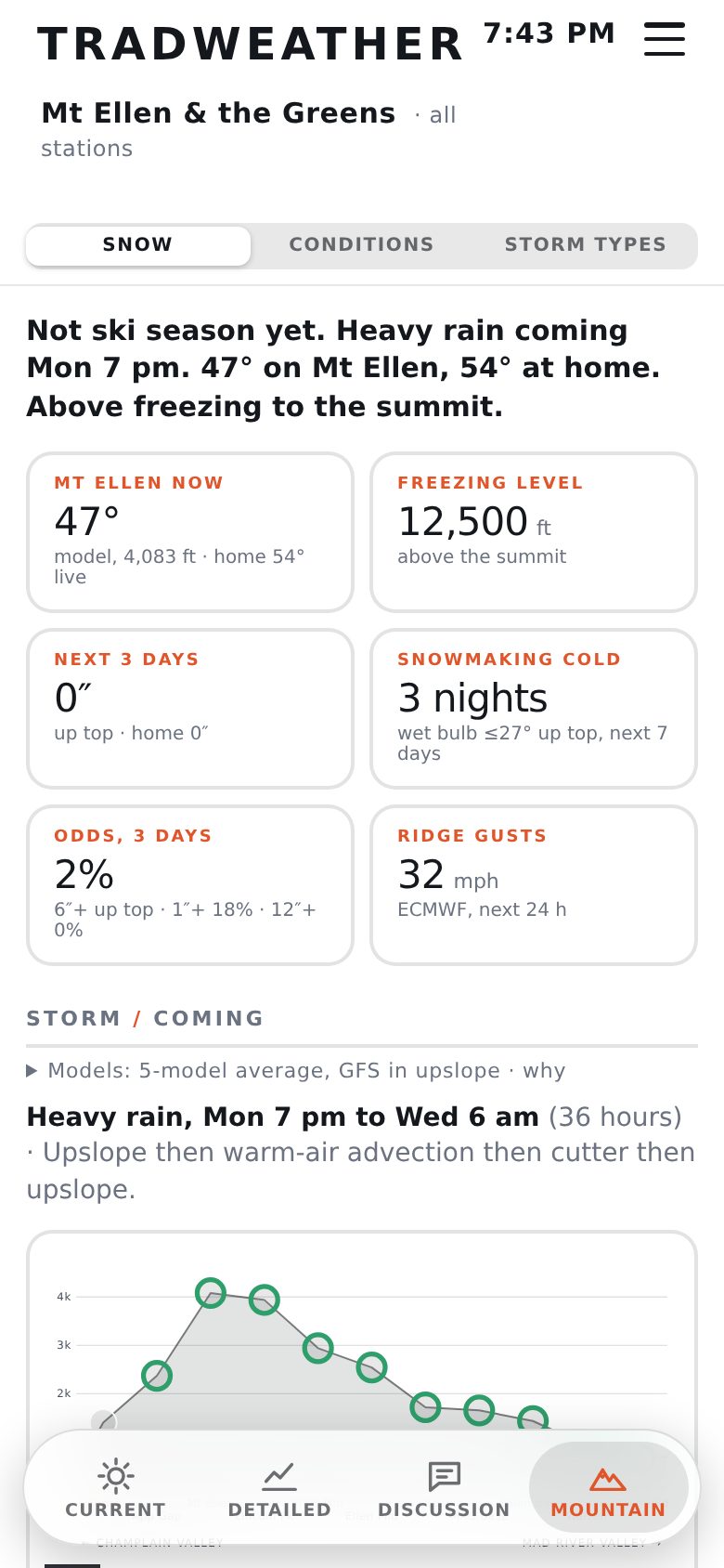 Snow
Snow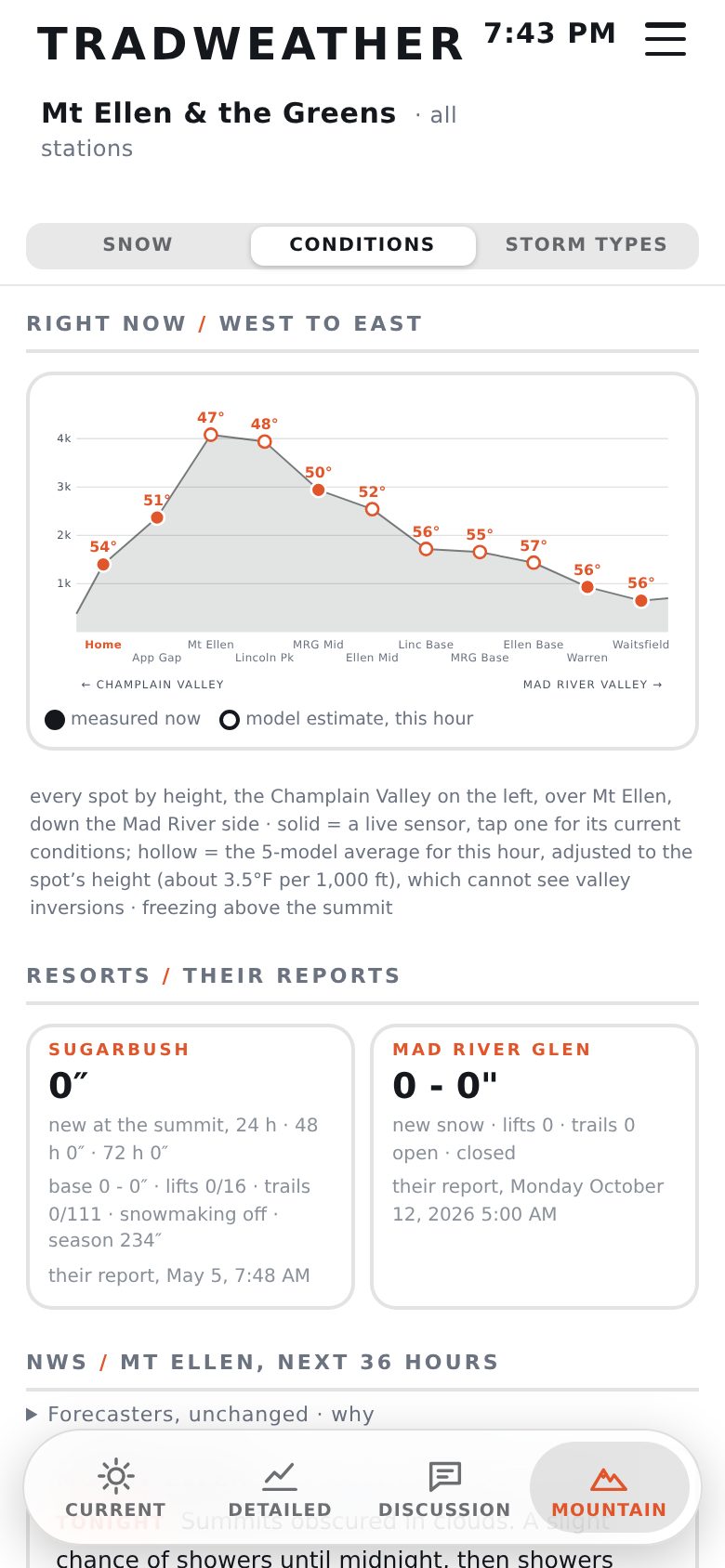 Conditions
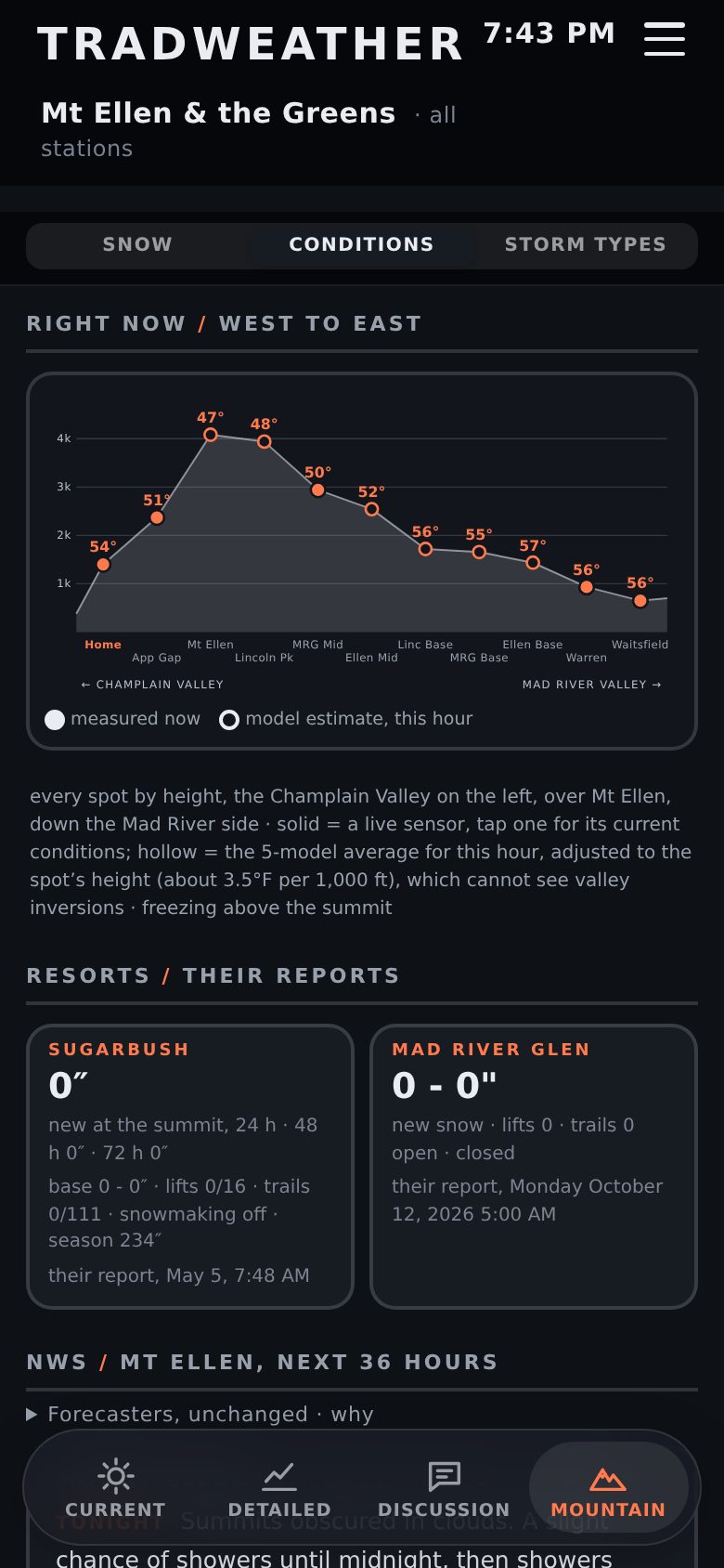 Conditions, dark
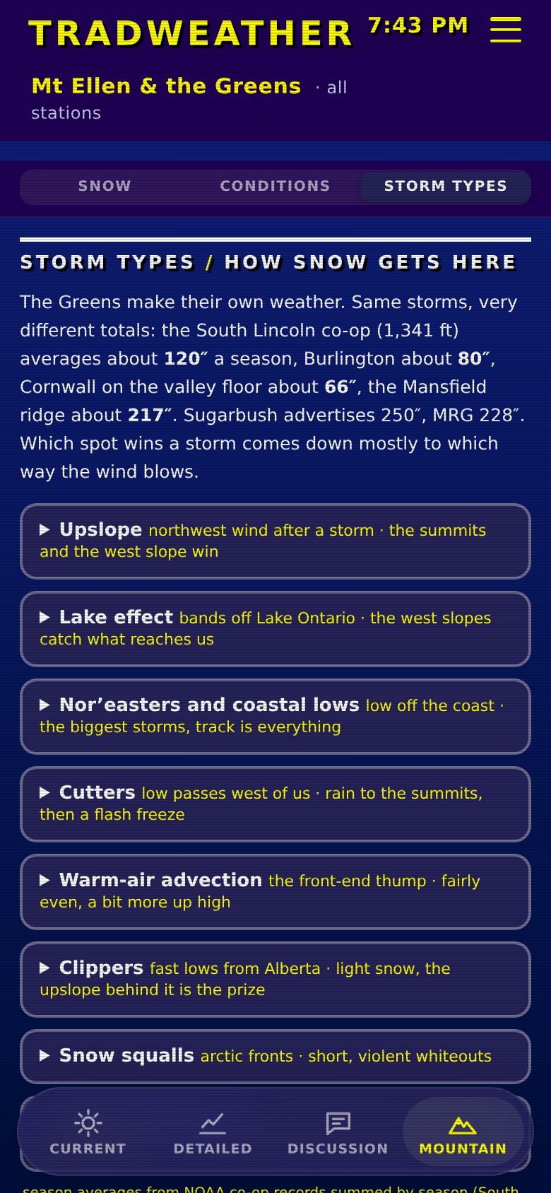 Storm Types, retro
Seven stations that are not mine
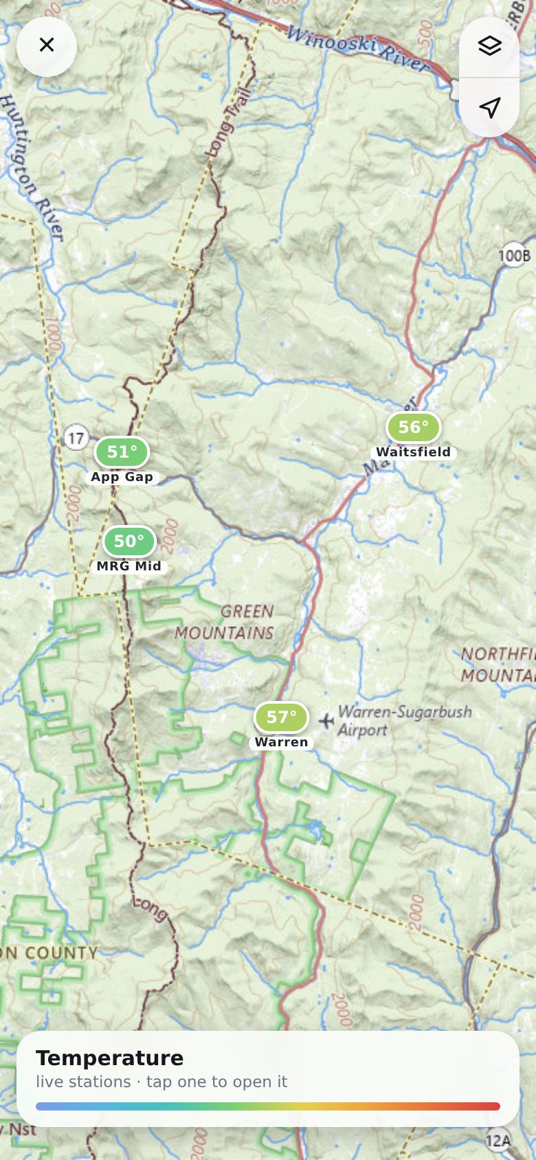
A cross-section needs real readings along it, and every source had to be free and keyless. Most come from Ambient Weather's public map, which returns every public station in a box in one call. It is undocumented (it is the same request their own map page makes), so I cache it for two minutes and expect it to break one day. The App Gap reading is a Vermont road-weather station that Iowa State'sEnvironmental Mesonet republishes 30 to 40 minutes late, so it counts as stale after 75 minutes and the rest after 30. Synoptic, the obvious aggregator, is free only for universities.
Picking a station uses the phone's own scrolling wheel: an invisible native select sits over the station name. Every station's Current view is baked into the page and CSS shows the chosen one, so switching costs nothing. The page grew from 229 KB to about 465 KB to pay for that.
A map you can actually use
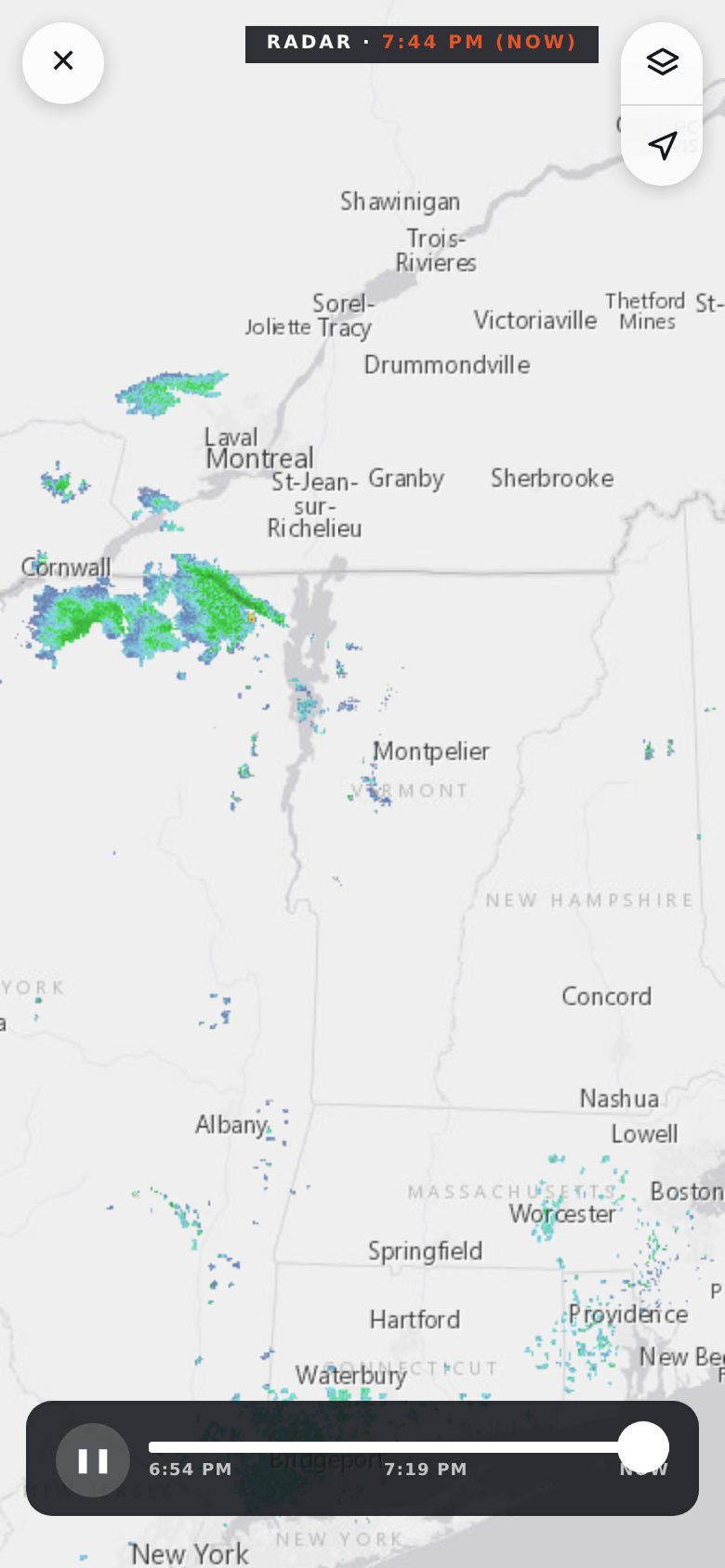
Radar stopped being its own tab and moved onto Current. Inline, the map ignores touch, because a live map in a scrolling page traps the scroll. Tap it and it goes full screen, and it pushes a browser history entry so the phone's back gesture closes it.
Full screen copies Apple Weather's controls: a close button, one layers list (radar, wind flow, temperature, humidity, dew point, rain today, pressure), a locate button, and a card along the bottom for the radar scrubber or the legend. The station layers sit on USGS topo maps, which are public domain, with ski trails from OpenSnowMap once you zoom in.
The basemap changed by force. CARTO started requiring an API key and drew "API KEY REQUIRED" across every tile. Radar now sits on Esri's keyless gray canvas.
Wind flow is the newest layer. Every three hours the renderer writes a small grid of Open-Meteo wind, 10 by 16 points over New York, Vermont and New Hampshire for the next 25 hours, and the page animates particles across it. The first version covered the map's buttons and popups. Leaflet's panes all share one stacking context, so a canvas outside the map sat on top of everything, and moving it into its own pane fixed that. Speed is time-based, and I tuned it on the phone: 2.5 pixels per second per mph was too slow, 10 was too fast, 4 felt right. Tapping the map gives the model's wind for that spot, labeled "model, open terrain", because it runs about five times windier than a gauge sheltered by trees (Porter measured that too).
 Radar
Radar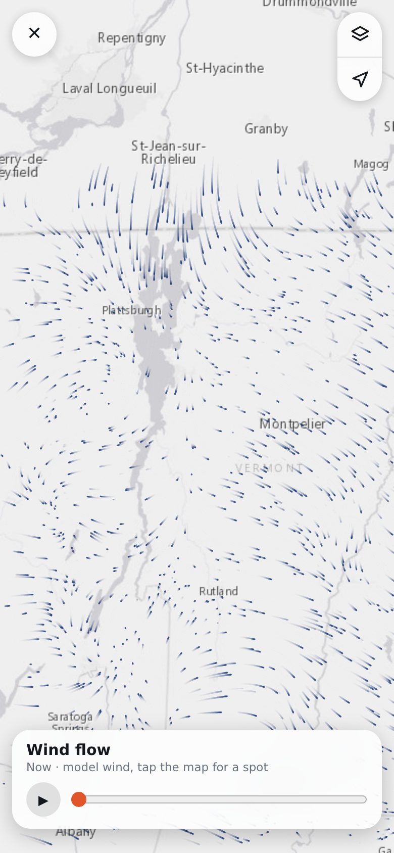 Wind flow
 Stations on topo
A layout that behaves like an app
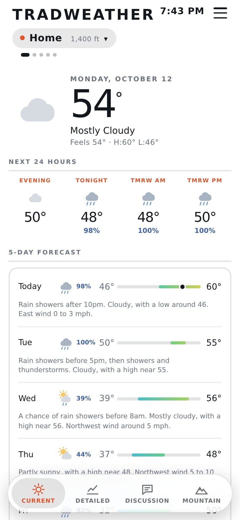
I set one rule: four top-level tabs, maximum. Within that, a second layout called Modern became the default on October 10. The tab bar floats at the bottom and shrinks to icons as you scroll. The big header collapses into a slim bar with the station and its temperature. Sub-tabs became a segmented control with a sliding thumb, and you swipe between stations on Current and between sub-tabs elsewhere. Any switch starts the new pane at its top. The original layout, with tabs along the top, is still in the menu, which replaced the old theme dropdown.
 Current
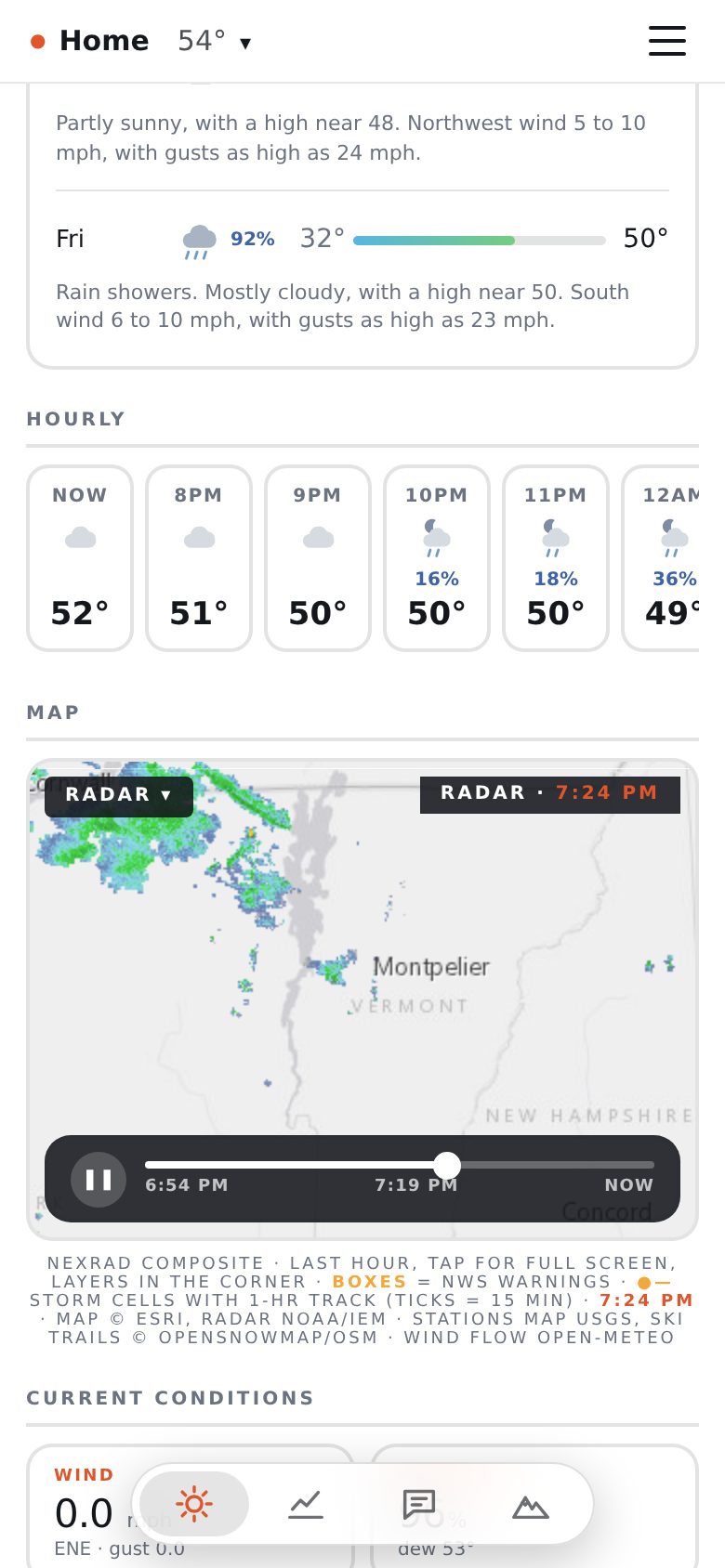 Scrolled
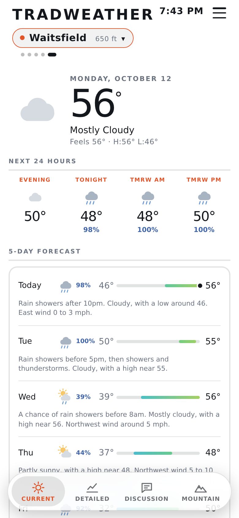 Another station
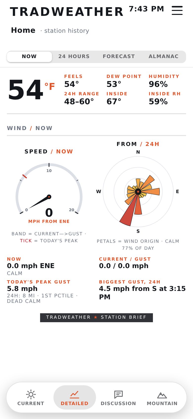 Detailed
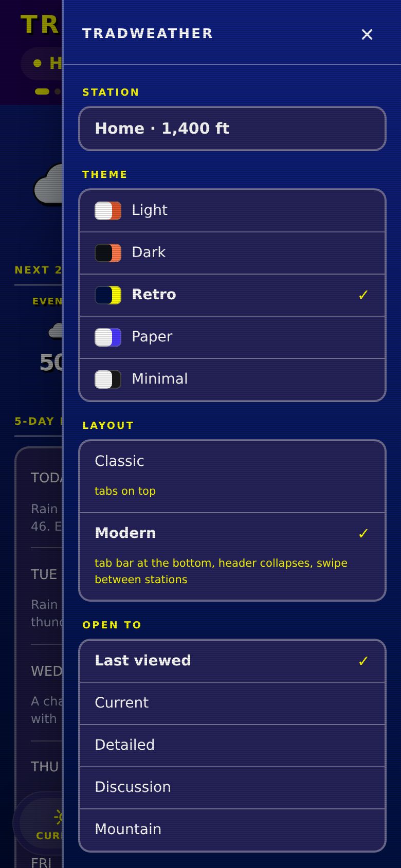 Menu
MenuWhat it cost
- iOS 26 Safari reports a top safe-area inset of about 47 pointseven though the page already starts below the status bar, so every sticky header sat too low. The inset now applies only when the page runs as a home-screen app. Safari also tints its top bar from fixed elements and ignores sticky ones, so a 3-pixel fixed strip stays at the top for that alone.
- Test renders share the live API key. A burst of them got the live page rate-limited twice. The old page kept serving, which is the only reason nobody noticed. Test renders now go a minute apart.
- Headless Chromium has blind spots. The version I use for screenshots has a 500-pixel minimum width, blanks screenshots of scrolled pages, and skips CSS transitions and map zoom animations. Measuring element positions worked better than trusting pictures.
- A negative top margin collapses through its parent, so the parent's position already includes it. That cost an 18-pixel miss in the code that scrolls each sub-tab back to its top.
Credit
The storm recipe, the storm guide and the idea of a mountain tab are Porter Haney's, from Up South Ski Forecast. Station readings come from Ambient Weather's public stations and VTrans through the Iowa Environmental Mesonet. Forecasts and wind come from Open-Meteo, radar from NOAA through the Iowa Environmental Mesonet, and the maps from Esri, USGS and OpenSnowMap.